Hub Elementor - Custom Mobile Header
In Hub Elementor, you can disable the default theme mobile header and design your own mobile header with Elementor.
This article was created using our ArcHub theme, but the custom mobile header creation process is the same for both themes.
1- Open your current header with Elementor 
2- Navigate to Settings > Mobile Navigation from Elementor and enable Mobile Header Builder. This option will disable the default theme mobile header.


3- Add a new section below your header. This will be your mobile header.

4- Add the elements you want to your mobile header. For example we add a logo and a Side Drawer for mobile menu.
 5- Set Horizontal Align to Space Between in column settings, so there will be space between logo and menu.

6- Now we will set the conditions. First, prevent your desktop header from appearing on mobile/tablet devices:

7- And now prevent your mobile header from appearing on desktop devices:

8- Now the mobile header is ready, but the menu is not working yet. Now let's set the menu. Save your header and return to WordPress Dashboard and create an Elementor Template called "Mobile Side Drawer Menu".

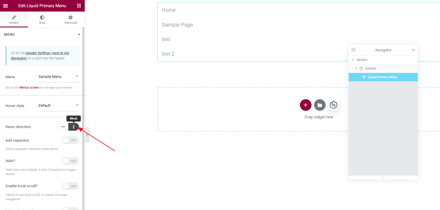
 9- Add the elements you want to your mobile menu. Now we just add the Primary menu. Then set Items Direction to Block from the Primary Menu element's options.

10- Save & publish the template and open your header with Elementor again. Then select the Mobile Side Drawer Menu template you just created from the Side Drawer options.

11- That's all, your mobile header & menu is ready.

